Designing your First Infographic
You’re at a meeting and the speaker pulls out an old and boring chart that doesn’t make sense at all or your reading a textbook and come across multiple graphs for the growth rate of monkeys in South America, we all have been there before and what did you do each time? You ignore it and moved on with your life. Right? Well, it doesn’t need to be like that. Graphs, charts, and data can be beautifully designed using infographics.
Infographics are basically the visualization of data. Infographics give you the ability to visually show a story, thesis, educate, inform, and build brand awareness.
Why would you want to make one? Well, how exciting is it to look at graphs and charts? Not very exciting but if you can show a story using data, visuals, and other graphics than the data becomes more exciting to look at and you will no longer skip through graphs.
Like any other design, infographics follow a design process. The steps that I followed are basic design process steps which include planning, research, sketches, wireframes, and design guide. By following each of these steps anyone can start their first infographic.
Choose a Theme
For the planning step, there are two parts. The first part involves choosing a theme and question while the second part involves getting data or information.
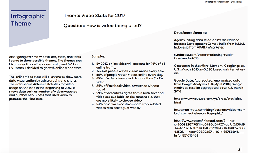
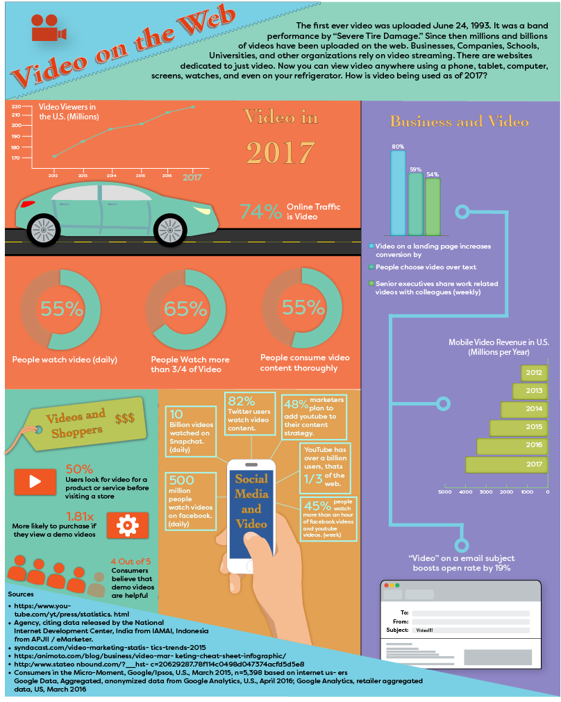
The theme tells you what the infographic is about. The theme can be about ice cream, monkeys, schools, politics, video games, movies, or anything that you want. For my infographic theme, I chose Online Video statistics.
After choosing a theme, the infographic needs to answer a question and that is “what is the data telling me.” For example, are you telling me “how to plant a garden” or “What is the expected growth rate of monkeys.” What is it that you want to get across to your audience? My question was How is video being used? The theme and question give you direction for the project and a purpose for making the infographic.
Get Data
The next step is to gather data and information. Many ways exist for gathering data, you can get it yourself through interviews or surveys, or you can use a search engine and search for data sets.
Remember the data and information should answer your question that is linked to your theme. Every well-designed infographic has their sources listed at the bottom of the infographic.
The sources give you credibility and avoids plagiarism. If someone sees your infographic and they want to know more about the data than they can go through the sources to find out more. After all, that is the purpose, to show data.
Research, Critique, and Repeat
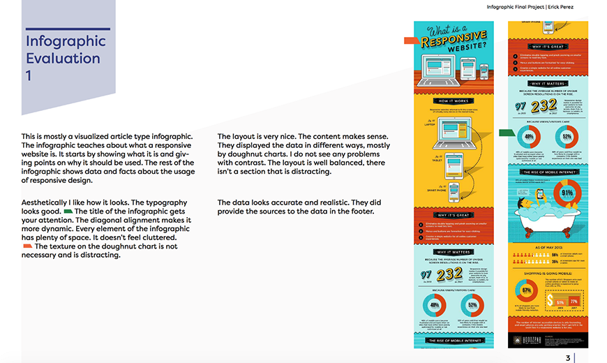
Find out what works and what doesn’t. even though the research step helps to avoid errors and mistakes, it can help with inspiration and ideas. By researching and finding other infographics you can see the good, bad, and terrible infographics others have made.
Start by looking at infographics that have a similar theme. The purpose of this step is to find infographics and evaluate them. Evaluate everything from the colors, fonts, graphs, illustrations, and even the data itself, does it make sense? Does it have a theme? What’s good or bad about it? What shapes or textures are being used? Critique each infographic from top to bottom so that you don’t make the same mistakes.
Doodles and Sketches
This is one of my favorite parts, sketching. Get your sketchbook or a line piece of paper and start sketching. This is the time to explore and experiment. Mistakes will be done but it’s okay, remember nobody needs to see your sketches.
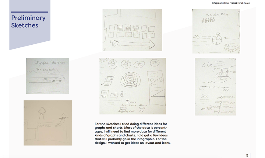
You’ve done your research and you got a theme, at this point the only thing stopping you is your imagination. Many things that I sketched out ended up on the infographic and other sketches didn’t. Anyone can sketch, it doesn’t matter if you can draw well. A sketch is just a rough drawing of something but it can guide to a more finished picture.
Outline
Make an outline of all the content. This part is not necessary in the design process but I find it to be very useful and I highly recommend it. An outline is just the plain text of the infographic.
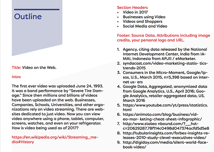
In any design content is king and by making an outline you focus on the content before you start designing the final infographic. In the outline include any type or text that will appear on the infographic. This includes the title, paragraphs, data, sources, or anything else.
The outline helps you to separate design elements, principles, and colors. At this point check for grammar and spelling errors. Once this step is finished than designing the final infographic can begin.
Wireframes
The best option is to start with a low-fidelity design and move to a high-fidelity design. Wireframes give the ability to create low-fidelity designs. A wireframe is like a skeletal blueprint of the final design.
Wireframes are usually low-fidelity because they only have lines and shapes, at this point there is no colors or textures. I used Adobe Illustrator to make the final design and wireframe of the infographic.
All infographics should be vector based and not pixel based. With vectors images keep their dimensions when resized. Vectors will never pixelate. Infographics look best as a vector based graphic.
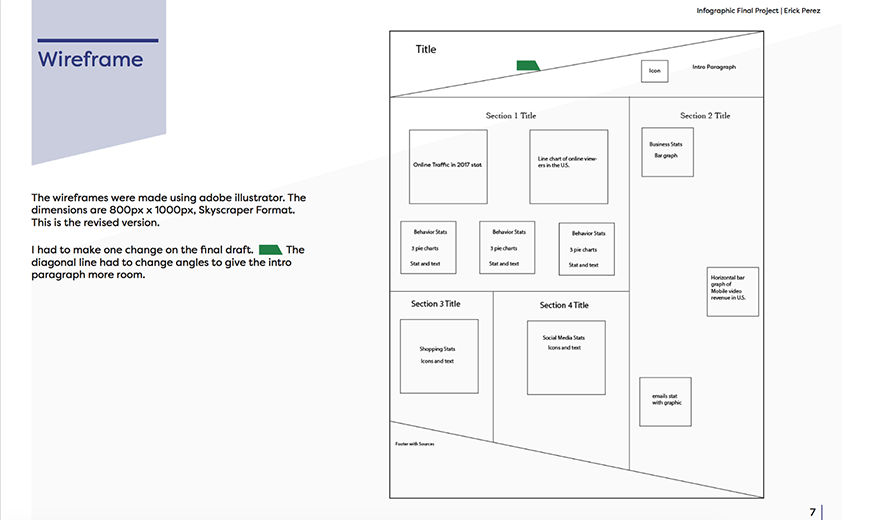
In my wireframe, I just have lines and shapes. I did include a short description of the layout of the data but nothing about design is displayed.
Design Guide
A design guide helps to make the process easier and faster. You can either start putting colors in the infographic until you find one that works or you can decide on a color palette before trial and error. Design guide for the infographic.
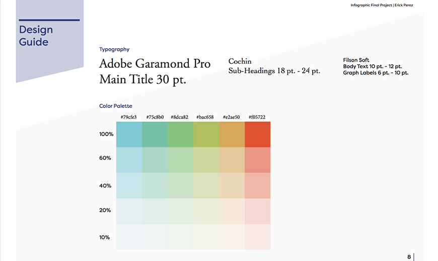
For an infographic design guide, you should at least include a color palette, fonts, and icons. Depending on the infographic you may need to add more items on the guide like branding.
After getting a design guide you can start applying it to the wireframes but remember that an infographic is a design and it needs to follow design principles. Once the infographic is finished it should remain as a vector. The PDF format can export the infographic as a vector graphic. Final Infographic.
Conclusion
Infographics are more about showing data. The data can be shown as a number, graphic, or story. Infographics are designs and should follow the design process of planning, research, sketches, wireframes, and design guide. Many infographics exist that are either good or bad but it takes time to design the best one. Infographics make graphs and charts at the meeting or on a textbook more exciting even if it’s about the growth rate of monkeys in South America.
Creating a good infographic requires solid research and planning, but also experimentation, iteration and lots of feedback — Department of Digital Media, Utah Valley University.
Links: