The Road to Prototypes

Most if not all designers and developers work with prototypes. The process or road that leads to prototypes is not easy and at times it takes a very long time to get to but it can be done.
Every corporate website visited and every major Mobile App used probably had a prototype. A prototype is a demonstration of what a website or an app will look like when it goes live. Prototypes give the ability to see a high-fidelity mockup of the website.
Prototypes can be used to easily test for usability and functionality. Prototypes are not made in one day but take weeks and even months to create detailed prototypes.
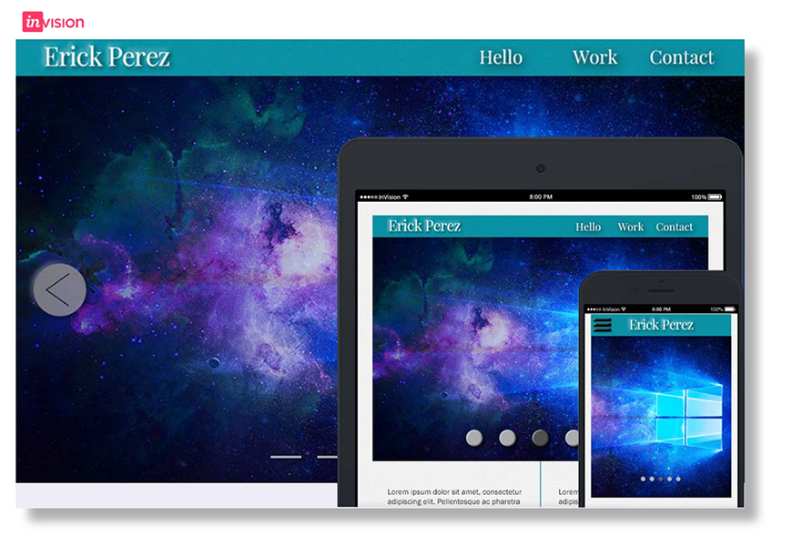
The mockup can be created as a sketch, an HTML site, or it can be pictures. For this prototype, the Invision App was used and it took about a month and a half to complete. With Invision different exported images from Adobe Photoshop, Sketch App, or personal images can be linked together to demonstrate the usability and functionality of a site. Before a prototype is made there must be a process or road that leads to prototypes.
For each stop on the road to prototypes 5 items will be covered the what, why, where, when, and how. The first stop is Concept Models. Concept models are a diagram that shows the relationships between different abstract ideas.
Concept models are sometimes confused with site maps but it’s not a site map because a concept model focuses on the process and not each page or section. The best time to make a concept model is at the beginning of a project.

The concept model focuses on the general domain, people (users), behaviors (usability), process (functionality), best practices, industry norms, etc. Start by sketching these categories and branch off them but at the same time link each category together.
On the sketch example the major categories can be easily identified for the portfolio website. In a portfolio website, there can be categories such as audience, clients, and resume.
Knowing the audience is one of the most important parts of the process towards prototypes. The audience are the people who will be using the prototype whether that’s a website or Mobile App.
Personas are used to better understand the audience. Personas are a summary representation of the system’s intended users, often described as real people. Personas should be created early in the process.
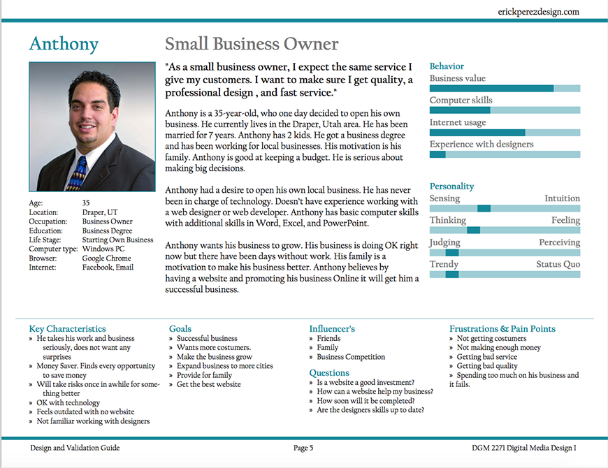
The personas are the type of people that will be using, visiting, or purchasing the website or Mobile App. Personas need to at least have a first name, profile picture, one line description, quote, short bio, stats/facts, goals, and key characteristics. The concept model can help to identify the personas.
Earlier site maps were mentioned. Site maps are a visual representation of the relationship between different pages on a website or Mobile App. Site maps focus on the structure of the site or App. Site maps can be considered as the navigation of a site, usually they work hand to hand with navigation.
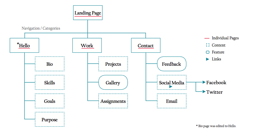
A site map is like a finished puzzle, all the pieces are in the correct place and the big picture can be seen. The navigation from page to page should make sense or the user will get lost and leave the site.
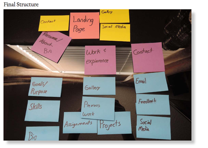
Site maps are best used when created half way in the process or right before designing. In the example this road stop started with labeling post it notes and arranging them in a logical order. After much feedback and re-arranging, the site map was made digital using a vector based program. This site map example was created using Adobe InDesign.
Now that site maps are created, wireframes can be sketched out. Wireframe is a simplified view of what content will appear on each screen of the final product, usually without color, type, styles, and images. Each page of a website gets a wireframe, and the wireframe acts as a blueprint for that page.
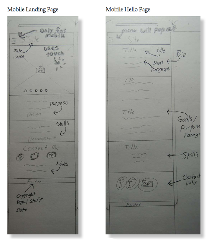
Sketching the wireframes first, allows for exploration and experimentation. With Sketches errors and mistakes can be made and can be easily fixed. Once a wireframe sketch is made digital, it is harder to fix mistakes.
Wireframes should be very accurate and have a description about styles that will be used. Wireframes don’t have color or styles enabling to only focus on content and layout. For the portfolio website, the wireframes were made using Adobe InDesign but any vector based program works.
The next stop is the design guide. The design guide is a guide that has all the styles, color, textures, etc. that will be used on the site or App.
Design guides give direction for styling a site or App, but it is also beneficial to have as a standard to follow because if a new member joins the designer team they won’t know what was planned especially if the original designer is gone.
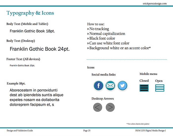
The design guide is the rules of the project, if everyone knows the rules everyone can be on the same page. The guide should be made after creating wireframes. In the example the design guide contains the typography, icons, and color palettes.
Before arriving at prototypes, surface comps or compositions need to be created. Surface comps are a representation of high-fidelity visual compositions of a final concept.
These are made right before prototypes. Surface comps are more detailed versions of wireframes and include all colors, typography, styles, icons, pictures, designs, textures, and layouts.
Prototypes can be created with sketches or wireframes but with surface comps there is a closer experience to the finally product once it goes live.
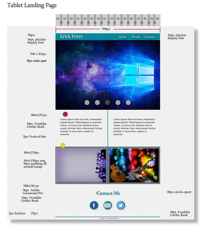
In the example the surface comps were created using Adobe Photoshop. Photoshop allows for pixel perfect designs. Since Invision has a feature that allows the user to import directly from Photoshop, Invision makes it easier to make prototypes.
After creating concept models, personas, site maps, wireframes, and surface comps then prototypes can be created. Testing for usability and functionality is possible with prototypes.
The road to prototypes may be hard and long but it is worth it. The portfolio website prototype took about a month and a half to create with only one person working on it but in the end, everything worked out smoothly.
Links:
